Some examples of digipaks include:
Kanye West- Graduation:
 Back cover
This particular example includes the artists name and the name of the album on the front cover. The artists name is spelt in incorrect cases much like his previous album "late registration" where his name was also spelt in incorrect cases. This is perhaps an intertextual reference between the two albums. The main image of the bear is also very similar to the "late registration" album as on that front cover there is also a bear. The use of a bright colour scheme to accompany this main image is very eye catching and fits into the conventions of digipaks. The reason these eye catching front covers are used is because it is usually the first thing people will see before buying this album, meaning if it is very eye catching and interesting the customer would be more likely to buy it.
The back cover contains a lot of the typical features you would expect to see on an album back cover. Firstly, it features the album track list at the top of the cover. This is positioned in the centre which is a common place which many albums use for their track list. This is because it stands out to the customer as they turn the album over. The name of the record company also features in the top left alongside the artists name and the album name once again. The barcode and legal information about the album also features on the left hand side of the album. The artwork on the back cover is the same as the front cover however it has effectively reversed.
Additional artwork:

The additional panels to this digipak are taken up by extra artwork which fits into the overall cartoon like theme.
Jay Z and Linkin Park- Collision Course:

This is the exterior of the Jay Z and Linkin Park album "Collision Course". The first thing you notice about the front cover is the two artist names. This is put right in the centre above the album name in order to make it stand out so that the customers can instantly know who has made this album and what it is called. The colour scheme seems dirty and gritty, perhaps suggesting that the music is a very urban style of music. The graffiti like artwork behind the artist and album names further suggest that this album is going to be a very urban like album. This theme is used over all covers of this digipak. The back cover uses the traditional track list in the centre of the screen as it makes the most sense and stands out better there. On this example is an additional special features sections which shows off what the customer is getting as extra on this album. This cover also includes a barcode at the top and a parental advisory sticker in the bottom left. This fits into this already urban like theme that this digipak has created as explicit language is typical associated with this genre.

This is the interior of the Jay Z and Linkin Park album. As you can see it uses the same scratchy and dirty colour scheme as the exterior panels do. The disk is a scratchy coloured blue with the same font used to put the artists' names at the top. The two extra panels use random pieces of artwork which use the same theme as the rest of the panels. Overall, this theme is consistently used for every single panel on this digipak.
Rihanna- Loud:
The front cover of this digipak example uses a close up of the artists herself. As already mentioned this heavily conforms to the typical conventions of digipak covers and shows off who the album is going to be all about. The font used for the artists name and the album name is very simple and elegant. It really shows off Rihanna's feminine side and heavily appeals to her target audience. The font size is purposefully quite small so it doesn't take away from the main image of the artist herself, however it is big enough for people to notice it. The fact that the album is called "Loud" and the main image is a close up suggests that this has been amplified deliberately in order to fit in with the title.
The 3 interior panels are used up as one large image spread across all 3 panels. This is yet another picture of Rihanna herself, again presented in a very feminine like way. The way it is placed is simple yet effective, as when you remove the disc you see the artist yet again. This helps to create familiarisation with the main artist and makes absolute sure that no one forgets who the album is by. The theme of the digipak is very genre heavy, as a lot of Rihanna's songs tend to be about love. There is frequent use of the colour red which is heavily associated with love and the use of petals also conforms to this idea.
Eminem- Curtain Call:
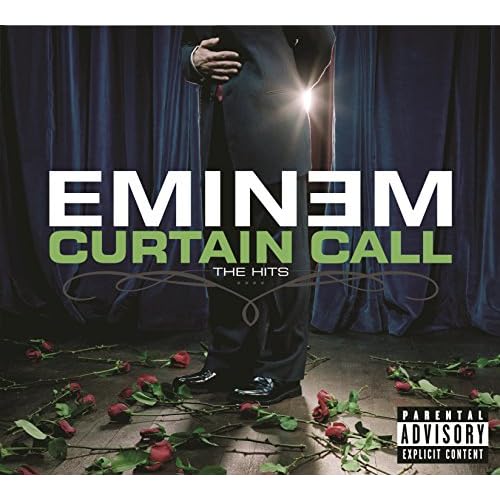
The front cover for this digipak includes a shot from the neck down of what we would presume to be the main artist. He appears to be bowing whilst roses are thrown to him as a sign of appreciation. The font for the artist and album name is simple yet effective as it is placed right in the centre. This means it is automatically drawn to by customers. There is also a parental advisory sticker in the bottom right which is very conventional of the rap/hip hop genre and is expected of Eminem. It is also interesting to note how the artists name is spelt differently, with the second 'e' being inverted. This is perhaps an intertextual reference to all of his other albums as on each one this is how it is spelt.

The back cover is also very conventional as it features a track list which is placed in the centre for maximum attention. The barcode is in the right corner whilst all of the legal information and the name of the record company is next to it. The image used in the background is a continuation of the image on the front cover, showing the artists feet where the roses have been thrown. This maintains a consistent theme throughout the digipak.
The CD itself uses yet another picture of the roses, however a close up this time. It is also a very dark image and all the colour has been taken out of the roses. This is a nice contrast to the front and back cover whilst still maintaining the same sort of theme. The same font is used on the CD as it is on the front cover.
The extra panels include a picture of the artist himself and a picture of the artist and album name with the definition of curtain call underneath. Overall, a consistent theme has been used throughout the whole digipak and a lot of the conventions of the genre and digipaks in general have been met.
No comments:
Post a Comment