Showing posts with label Digipak. Show all posts

Sunday, 19 February 2017

Improvements made to digipak


In between the creation of our music video I have made significant improvements to my digipak and magazine advert. One real positive was that all the pictures that we took were usable which meant we didn't have to go out again and take some more. I feel I have made a considerable amount of progress on my first draft which looked like this:

For example, I coloured the background of the CD panels, coloured the spines, created two of my own spines and got rid of a lot of text to make it simpler to read and understand.

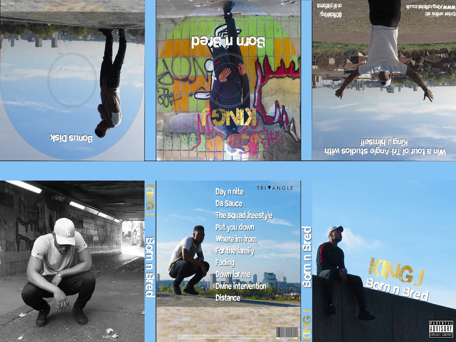
Here are some more examples of past drafts for my digipak and some of the progress I have made:


Tuesday, 6 December 2016

Digipak updated


This is my updated digipak. Its not completely final but its an update to say the least. i have changed the main font for King J and made some of the white text bolder so it can stand out more. I also changed the font on the competition panel for the social media links. Furthermore I have changed the background of the bonus disk to black and white like I did with the main CD. I felt that this makes it look better as originally the main CD stood out and looked out of place compared to the bonus disk.

I have also kept working on my magazine advert.


I have changed this heavily. I changed the main picture to the one it is now and included the front cover of my digipak in the right hand corner. I also included social media links and streaming sites where the album is going to be available.

Tuesday, 29 November 2016

Digipak fonts


For my digipak I chose a few key fonts which I used. The first was City life which I used on one of my extra panels. The second was Vintage College which I used as my main artist logo font. However this one might change as I continue with my digipak. The last one was City Burn which I used for the majority of my text. I am happy with all of these fonts, however my teachers have told me that the vintage college one might not suit the genre.

Friday, 25 November 2016

Chosen pictures for my digipak and magazine advert


Here are the photos that I have chosen to use for my digipak and magazine advert. These were all taken on the same day when we all went to Thamesmead for our photoshoot.

Photoshop work

During class whenever we haven't been filming I have been working on my digipak on Photoshop. So far I have got all of my digipak done as well as my magazine advert and am now waiting for feedback to improve it.


Tuesday, 15 November 2016

Digipak first draft


This is the first draft of my digipak. I am yet to do the spines which I will complete in my next lesson but the 6 main panels for the digipak are done. My teacher had a look at my digipak so far and gave me some feedback on how to improve it. First she said that the "King J" font should stand out more seeing as it is the artist logo. She also told me to reduce the size of the tracklist, remove the album name from the left hand corner of that panel and take the background out of the Tri-Angle logo. Moving on to the far left extra panel she said to remove "King J" from  the right hand corner and just leave the picture. For the bonus disk she recommended removing all the text apart from "Bonus Disk". She also said to take the colour away from the image to make it black and white. Finally for the last extra panel in the top right she suggested to remove a lot of the font so to not over complicate the panel. I have made these improvements to my digipak now and will begin improving my magazine advert too.